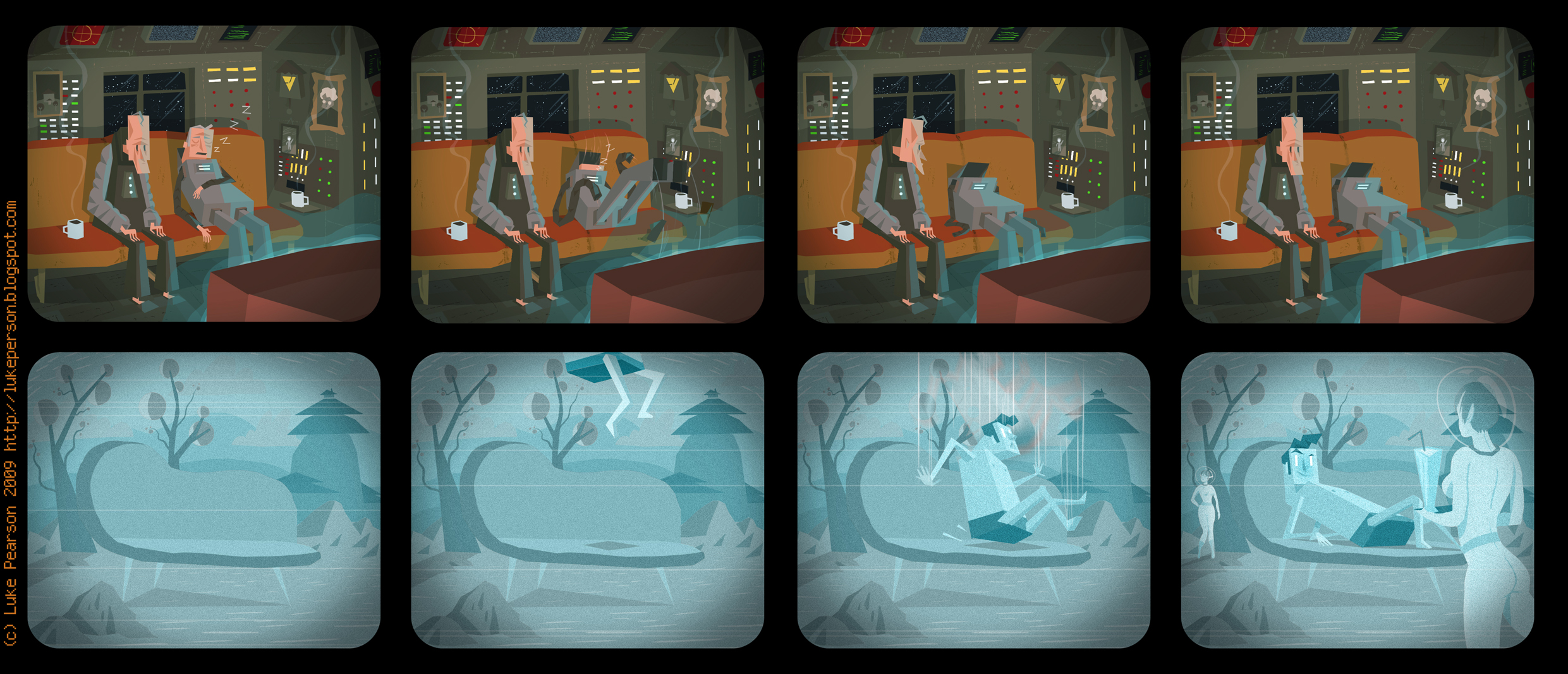
Getting too into it

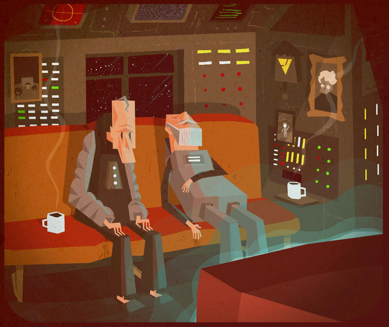
 I altered the original version of this comic to address readability issues. I've included the original first frame as an image in it's own right because I liked how the guy looked and I was quite happy with this sleepy spaceship/living room environment. In the comic now, the sleeping guy is beardless and his face is in full view as people weren't understanding him at first glance. I also blued the colours a bit to make it more consistent with the glow of the tv and to hopefully help people make the connection between the two rows more quickly.
Labels: comics, illustration


3 Comments:
ooo yeah the old men look so cool. I really like the way this looks. The different colours in each row are nice and that old man catching some Z's is one hell of a guy.
You might not like it as much anymore, as I changed the colours a bit and changed his head so he's beardless. People weren't reading him as human and my mum thought his beard was a mask or something.
I still can't believe he has gone. Haha i just came here to get another look at him especially. At least he has his own picture now. Just looked at the hands, the other guys hands are amazing.
Post a Comment
Subscribe to Post Comments [Atom]
<< Home